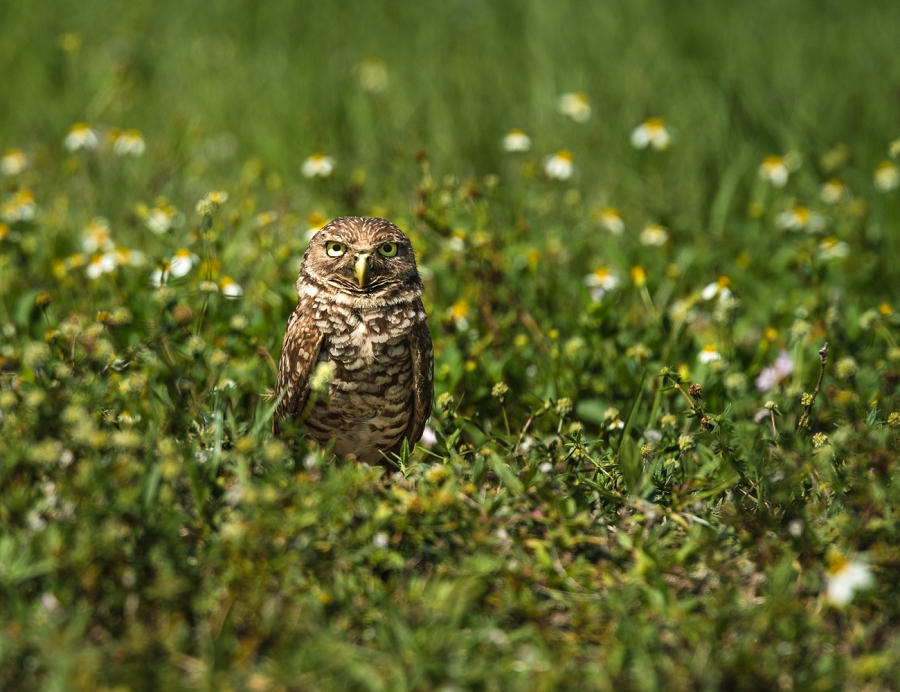
Owl Among the Flowers
- Contest: Signs of Spring
- Submitted by: Ibis Hillencamp
- DESCRIPTION AND SETTINGS : Taken at Brian Piccolo Park with Nikon D 810 F 5.6 SS 1/400 ISO 100. I used a lens extension making my lens 320mm.
- Judge's Critique: Good shot and it seems the photographer was close to being at the owl’s eye level. The depth of field seems appropriate for this subject. Not everything needs to be tack sharp to have a successful image. A slight underexposing from the metering would have helped this shot. Underexposing can add contrast and saturation enhancing the image. This change in exposure can also be addressed in post processing. Notice the owl’s left eye as we view the image. See the blown out section? A catch light always enhances an animal’s or person’s eye. But there are always exceptions to every rule. The exception is when and animal’s eyes are bright and/or colorful. The segment in this owl’s eye is more than just a catch light. It’s a large blown out area in relation to the size of the eye. Enough about that. The image seems a little bright and flat and the background and foreground are larger than they need to be. The foreground being out of focus does not add interest due to the lack of flowers. See the visual critique. Is the edit a stronger image? Does it emphasize the title of the image? Does a little darkening, contrast, and fixing the blown out portion of the eye (ok, I will mention it one more time) create a stronger image?
Powered by NorrCompetition

Comments (0)