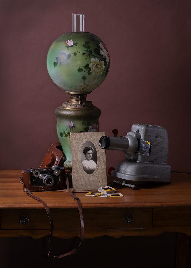
Vintage

EXIF
- NIKON CORPORATION
- photo_camera Model: NIKON D7100
- exposure Exposure: 1/60 (0.017 sec)
- shutter_speed Aperture: f/13.0
- lens Focal Length: 50.0 mm
- iso ISO: 200
- timer Date taken: 2022:08:30 10:41:28
- flash_on Flash: Fired
- Contest: STILL LIFE PHOTOGRAPHY
- Submitted by: Jim Farrington
- Sandy Levy: 89
- Ivan Prasin: 94
- Mark Battista: 100
- SCORE: 94.33
- Category: Excellent (88-94) - a well done image
- Mark Battista's Critique: A very strong composition. The leading lines of the camera strap, projector and rolls of film lead the eye to the portrait. The slight vignette helps keep the viewer’s eye withing the image, without being too obtrusive. ( A suggestion…I am being really super picky…. It is not a big issue ) Watch for any mergers/ tangents. The top of the small camera on the left merges slightly wit the edge of the table. If that camera body was paced back about 2-3 inches, the top of the camera would extend beyond the table’s back edge avoiding a tangent. Everything else is well placed. Every element relates so well to everything else. The shapes are so well divided in the image….the way that one item overlaps another and create interesting shapes.
Powered by NorrCompetition
Comments (1)