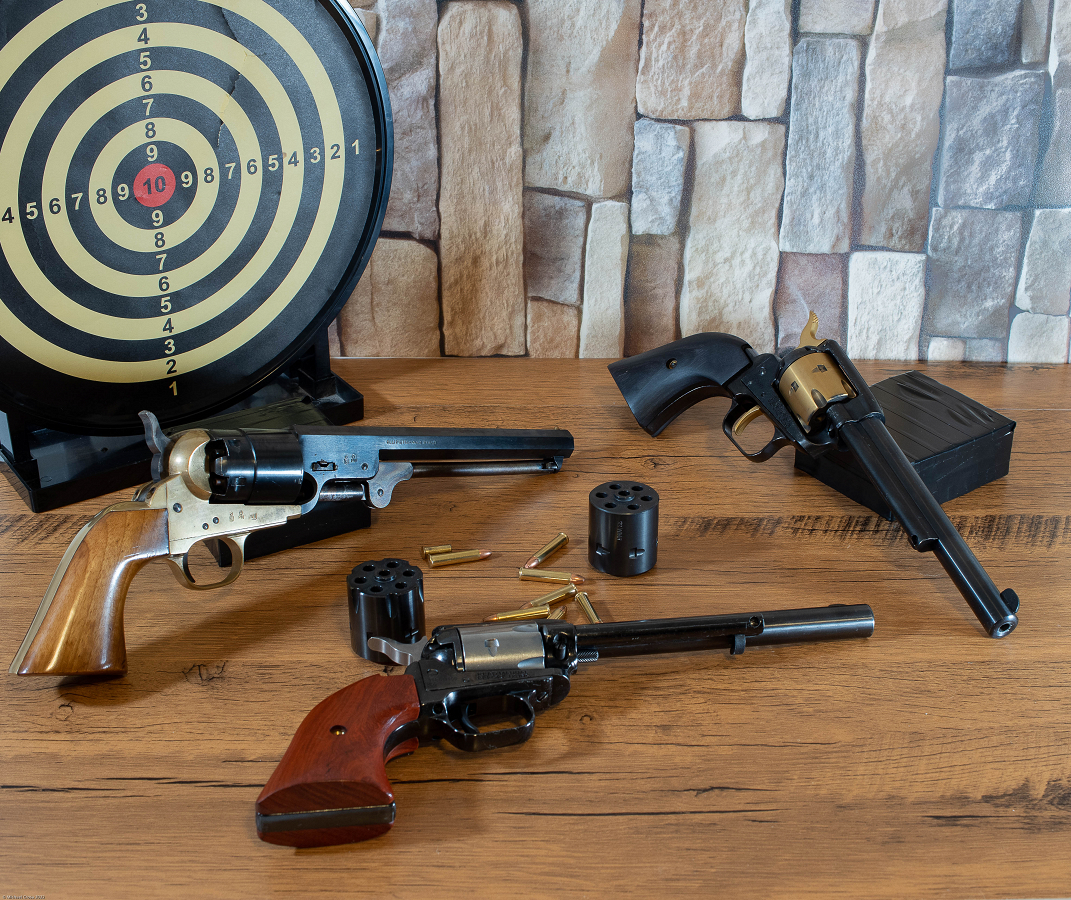
Wheel Guns

EXIF
- OLYMPUS CORPORATION
- photo_camera Model: E-M1MarkIII
- exposure Exposure: 4/5 (0.800 sec)
- shutter_speed Aperture: f/7.1
- lens Focal Length: 25.0 mm
- iso ISO: 200
- timer Date taken: 2022:08:30 14:03:31
- flash_on Flash: No flash function
- Contest: STILL LIFE PHOTOGRAPHY
- Submitted by: Michael Crosa
- DESCRIPTION AND SETTINGS : Olympus EM1 MK III
- Sandy Levy: 88
- Ivan Prasin: 84
- Mark Battista: 84
- SCORE: 85.33
- Category: Good (80-87) - above average image, but could be improved
- Mark Battista's Critique: The composition tells a story and communicates an idea. The placement of the horizon (back edge of the table) is placed higher than the middle of the image, thus giving more attention to the pistols on the table. The revolvers are staggered in the composition to provide interest. The light could be a little more directional and dramatic on this image. You might want to photograph it in a darkened room and only use one light….an LED light, single window near the setup or a speedlight and try to create some drama. There is nice light hitting the barrel and cylinder of the wheel gun on the left. I would like to see more light like that on the rest of the subject.
Powered by NorrCompetition
Comments (0)