October

EXIF
- NIKON CORPORATION
- photo_camera Model: NIKON D850
- exposure Exposure: 1/80 (0.013 sec)
- shutter_speed Aperture: f/4.0
- lens Focal Length: 75.0 mm
- iso ISO: 800
- timer Date taken: 2022:01:30 10:19:44
- flash_on Flash: Did not fire
- Contest: STILL LIFE PHOTOGRAPHY
- Submitted by: Pilar Geada
- Sandy Levy: 94
- Ivan Prasin: 82
- Mark Battista: 83
- SCORE: 86.33
- Category: Good (80-87) - above average image, but could be improved
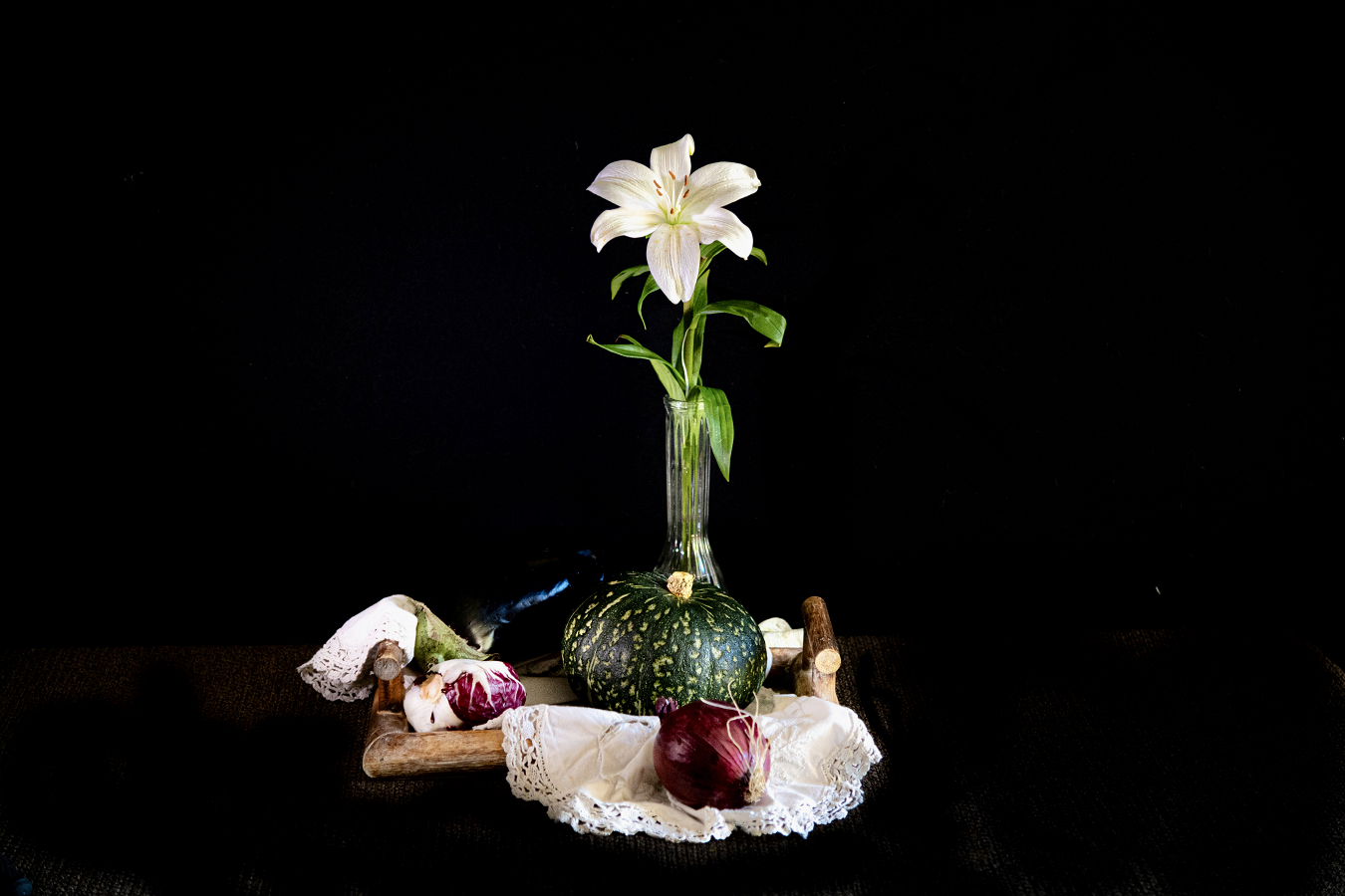
- Mark Battista's Critique: This composition has the elements arranged in a triangle. This beautifully leads our eye up toward the white lily. The focus/ sharpness is good on this image. There are a few shapes in the background that are a little distracting. There is a white dot over toward the right that can be cloned out and some partially seen element near the left side…possible some fabric??? I would either clone it all out or if it is in, allow it to be seen a little more.
Powered by NorrCompetition
Comments (0)