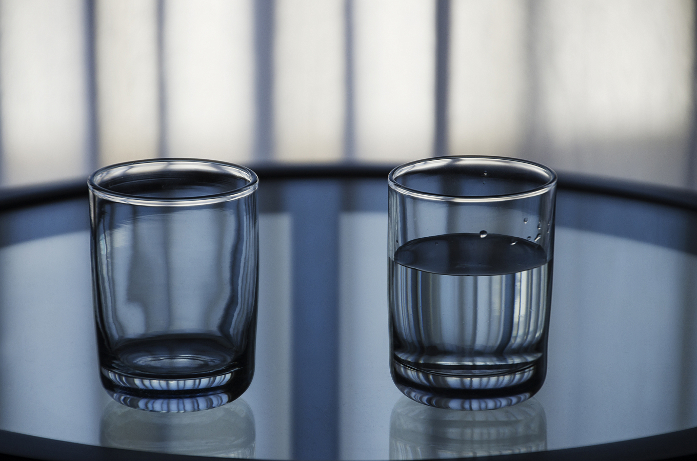
Half Full

EXIF
- NIKON CORPORATION
- photo_camera Model: NIKON D7000
- exposure Exposure: 1/400 (0.003 sec)
- shutter_speed Aperture: f/6.0
- lens Focal Length: 155.0 mm
- iso ISO: 200
- timer Date taken: 2020:11:16 12:37:43
- flash_on Flash: Did not fire
- Contest: STILL LIFE PHOTOGRAPHY
- Submitted by: Inna Malostovker
- Sandy Levy: 79
- Ivan Prasin: 84
- Mark Battista: 98
- SCORE: 87
- Category: Excellent (88-94) - a well done image
- Mark Battista's Critique: Beautifully composed design. The monochromatic color palette works so well with the them of water/ liquid. The reflections are beautifully controlled. An option to try. If this was shot from a bit higher, you might be able to eliminate the white sections in the upper part of the design. It would allow the strong light oval highlights on the top of the glasses to pop even more.
Powered by NorrCompetition
Comments (0)