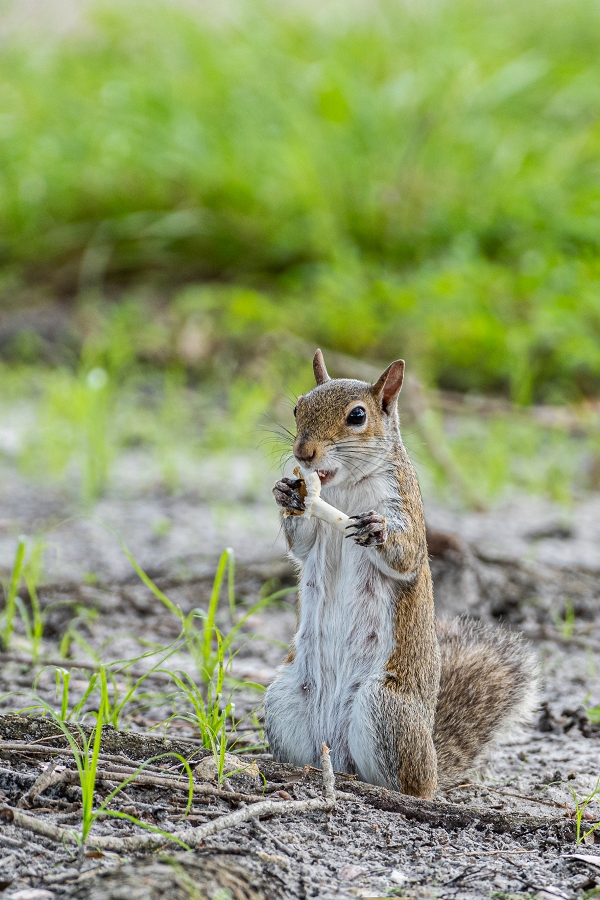
Squirrel

EXIF
- NIKON CORPORATION
- photo_camera Model: NIKON D500
- exposure Exposure: 1/250 (0.004 sec)
- shutter_speed Aperture: f/5.6
- lens Focal Length: 500.0 mm
- iso ISO: 400
- timer Date taken: 2020:07:28 10:54:03
- flash_on Flash: Did not fire
- Contest: Bokeh
- Submitted by: Rolando Prol
- Judge's Critique: The background is out of focus, but the quality of the bokeh could have been improved. Also notice how bright the image, and more specifically the background is. The viewers eye will always go to the brightest part of an image. The squirrel is small in the frame when it should dominate the frame. It is the subject after all. Bokeh is the digital challenge and for this shot is used to support the subject. The image also feels a little bright. Compare the side-by-side visual critique. Does the crop and processing for color, tonality, and contrast improve the image? Look close and you will notice I removed a poorly place stick.
Powered by NorrCompetition
Comments (0)