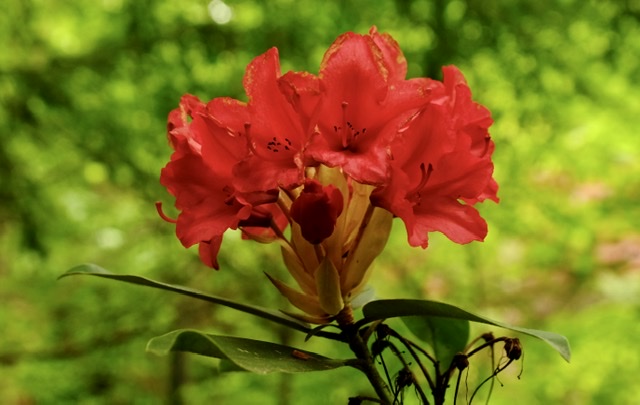
Red Rhododendron
- Contest: Bokeh
- Submitted by: Robert Karafel
- Judge's Critique: The color red begs to be photographed. The challenge is to photograph and process red in such a way to not lose detail with saturation. The bokeh is ok, but it doesn’t seem to support the flower well. The bokeh in the original feels busy and competes for attention with the flower instead of supporting/complementing it. There are also some distracting elements at the bottom of the flower. Compare the side-by-side visual critique. Did the crop for composition and enhancing the bokeh change the feel?
Powered by NorrCompetition

Comments (0)