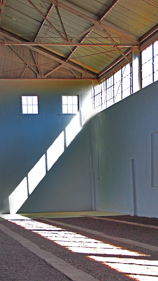
Window light

EXIF
- CANON
- photo_camera Model: Canon EOS REBEL T2i
- exposure Exposure: 1/90 (0.011 sec)
- shutter_speed Aperture: f/4.5
- lens Focal Length: 23.0 mm
- iso ISO: 100
- flash_on Flash: Did not fire
- Contest: Diagonal Lines
-
Judge's Critique:
Window light: The diagonal line created by the window light was a good idea, but this image falls apart on execution. It is not good enough to enter an image into a contest that only meets the challenge parameters. The image must be well composed, exposed, and processed. It should also make a statement and have impact. Zoom in on the image and you will notice fringing (chromatic aberration) on the windows and edges of the bar joists in the ceiling. Google “what is color fringing in photography”. It also looks like there was some cloning and or patching in the upper portion of the corner where the light originates.
Score – 64
Powered by NorrCompetition
Comments (0)