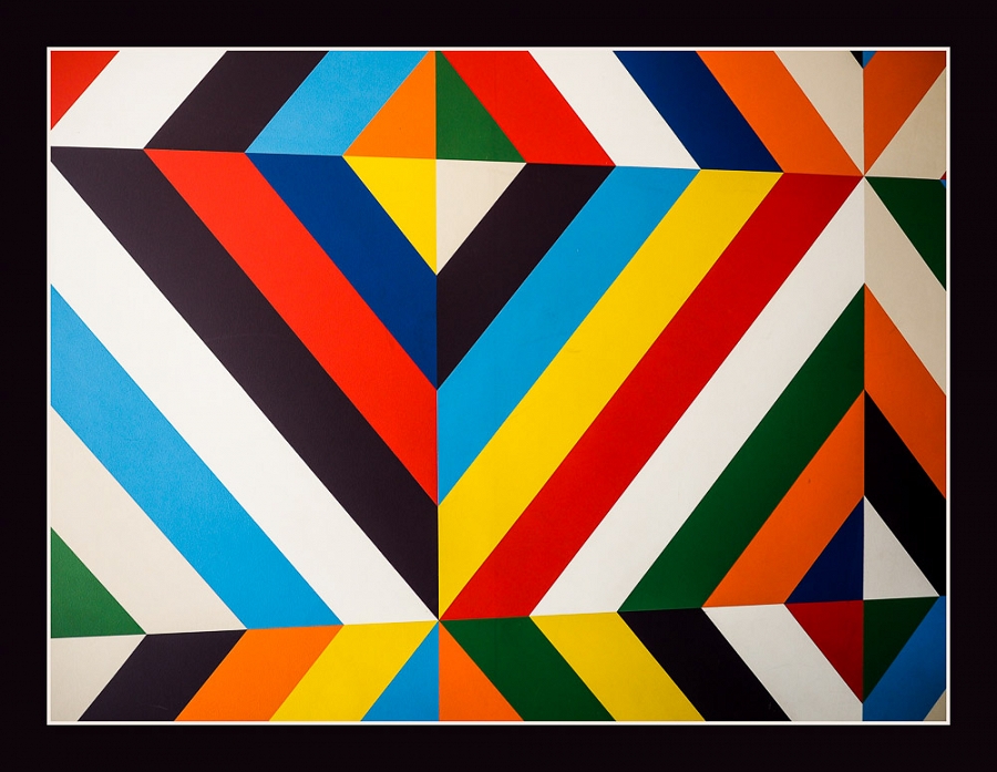
Colorful Design

EXIF
- OLYMPUS IMAGING CORP.
- photo_camera Model: E-M5MarkII
- exposure Exposure: 1/500 (0.002 sec)
- shutter_speed Aperture: f/2.8
- lens Focal Length: 12.0 mm
- iso ISO: 200
- timer Date taken: 2018:04:27 17:36:37
- flash_on Flash: Did not fire
- Contest: Diagonal Lines
- DESCRIPTION AND SETTINGS : This was shot on the campus of the University of California at Santa Barbara. I was attracted to all the neat designs and colors.
- Judge's Critique: Colorful Design: Yes, there are diagonal lines in this shot, but this is also a photograph of someone else’s artwork. It seems to me the idea of the challenge was to use diagonal lines to lead the viewer through the image. These diagonal lines create an abstract image, and notice the perspective. It was photographed from the left with the focal plain not parallel with subject. Notice the converging lines? See the visual critique for perspective and symmetry composition ideas. Did the change help the image? Don’t photograph someone else’s art for a competition. Score – 66
Powered by NorrCompetition
Comments (0)