What is Contrast in Photography? (And How to Really Use It)
Understanding contrast in photography is vital if you want to be a good photographer. Contrast is one of the key artistic elements within photography. Whether you’re shooting black and white or color, understanding contrast helps you produce better photographs.
In this article, we take an in-depth look at contrast in photography. We look at what it is and the different types found in photography. And we’ll explore how you can use contrast to take more impactful images. This article will also help you use contrast in the editing suite, giving you pictures even more heft.
Keep reading if you want to understand more about contrast in photography.
 Example of high tonal contrast on Adox CMS 20 © Kit Bryan-Smith
What is Contrast in Photography?
There are two main types of contrast in photography: tonal and color contrast. We look at both types of contrast below.
Tonal Contrast
Tonal contrast is the range between the brightest and darkest parts of an image.
If the image has very bright light areas and very dark dark areas, it is a high-contrast image. The whites will be bright white and the blacks will be pitch black. You have a tone at either extreme of the tonal spectrum, which creates contrast in the photo.
As you can see in the image below, the shadowed areas are deep and dark. The blacks don’t get much blacker. But the bright areas are almost dazzlingly white. There are very few shades of grey in between the rich black and harsh white
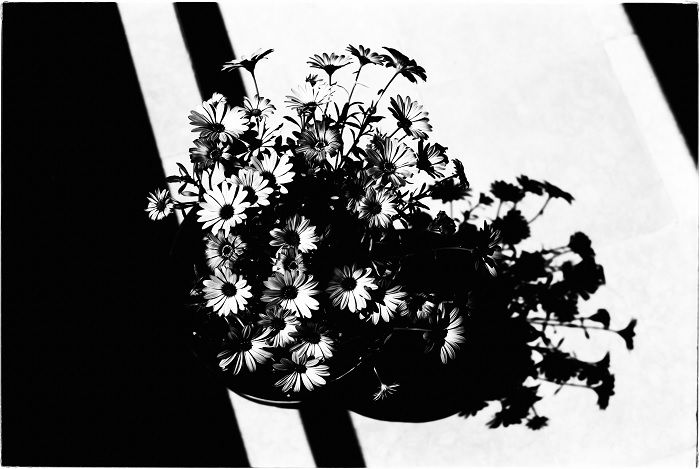 High contrast image shot on Adox CMS 20 © Kit Bryan-Smith
A low-contrast image has very little difference between the brightest and darkest areas. The narrow tonal range means there are no extremes in the image’s bright or dark sections. All the tones are more tightly grouped together.
In the example below, you can see that a low-contrast image has many middle tones with much at either extreme. Apart from the deep black of the sheep’s face, the image is made up of many different grey tone from the centre of the spectrum.
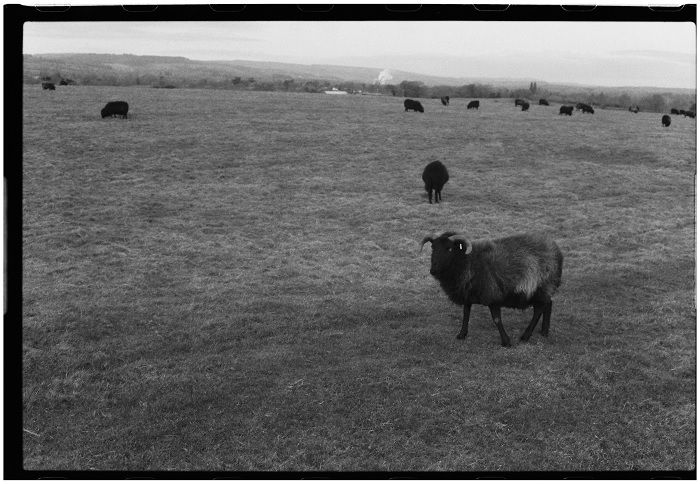 Low-contrast shot on Rollei RPX 400 © Kit Bryan-Smith
The most striking examples of tonal contrast are found in black and white photography. However, tonal contrast still plays a part in color photography.
Whether black and white or color, an image can have a high or low tonal contrast. It all depends on the difference between the brightest and darkest parts of the photograph.
Tonal contrast relates directly to dynamic range. The dynamic range it a camera’s ability to capture detail in bright and dark areas of the same image. The more detail it can detect in very bright and very dark sections, the wider the camera’s dynamic range.
Color Contrast
Color contrast is the relationship between two different colors in one image. We can use artistic color theory to help us understand this concept.
Different colors relate to each other in different ways. To understand the way in which colors relate to one another, we need to look at the color wheel.
The color wheel shows us all the colors in the spectrum. And in this format, we can see how each color’s position in the wheel determines its relationship to all the other colors.
When it comes to color contrast, we need to understand complimentary colors. These colors have the biggest contrast between each other because they are exact opposites on the color wheel.
If you’re working with red, the color with the biggest contrast level is green. If you’re starting with blue, yellow has the highest contrast.
As you might guess, complimentary colors work well together. They produce a pleasing, harmonious feeling when used together in an image.
Using bright yellow and bright blue, the image below has a high color contrast.
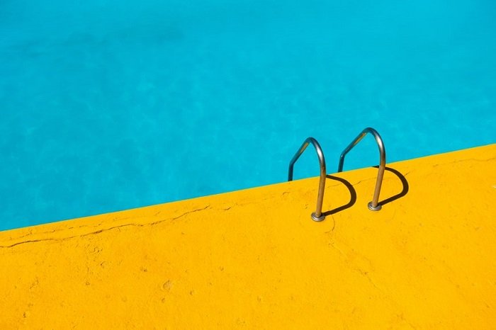 High color contrast with yellow and blue © Etienne Girardet
Photos that include different variations of the same color have a low color contrast.
The image below has many shades of green and blur, but very little from the other side of the color wheel. This is an analogous color scheme that gives us a very low level of color contrast.
 Low color contrast image on Silver Screen Negative 200 © Kit Bryan-Smith
This also helps us to understand contrast more generally. As with colors on the color wheel, contrast in photography is the relationship of two opposing visual elements.
High contrast means they are far apart from one another. Low contrast means there’s very little distance between the two.
How to Use Contrast for Better Photos
Now we have a better understanding of what contrast in photography is, we can use that knowledge to produce more impactful photographs. We can consciously bring tonal and color contrast into our work, giving us more creative control.
It doesn’t matter if you’re a portrait or landscape photographer, you can use contrast to make your images stronger. Finding the right balance is satisfying and makes your work look more professional.
Using Tonal Contrast in Photography
Light is one of the most important elements when it comes to contrast. And tonal contrast is all about light and shade.
Bright, direct light tends to give us high-contrast images. The light illuminates unshaded areas, and physical elements in the scene cast strong shadows. In a scene like this, you get bright light areas and pitch-like dark areas.
Once you understand this, this type of contrast becomes easy to look for. You need strong directional light and shadows created by physical obstructions. When contrast is at its strongest, elements in the image will be silhouettes with little detail.
This can be a tree casting a shadow from a low-hanging sun. Maybe it’s sunlight passing through a colonnade. Or light could be coming through a window in an otherwise dark room, as in the photo below.
 Shot on Fomapan 100 © Kit Bryan-Smith
You can also look for low-contrast scenes where light is consistent across the frame. While very low-contrast scenes often look flat, this might be exactly what you want for a particular type of shot.
Midday sunlight lends itself to low-contrast images. As the sun is directly above the scene, light is evenly intense and shadows are small.
With a flat, low-contrast scene, it’s easy to make other elements stand out. Even something small can punctuate a low-contrast landscape, making it more visually interesting.
 Low-contrast image of beach on Kosmo 100 © Kit Bryan-Smith
But photographers don’t always want an extreme level of contrast. It can work well in some images, but in most cases they want to find a balance.
You want enough contrast to give the image a bit of life and texture. But you don’t want so much that it dominates or distracts from your subject.
The landscape below is a brilliant example of an image with perfectly balanced tonal contrast.
While there are some areas of light and shade, they are not black and white. We see detail in all areas. And thanks to the rocks and trees, there are points of contrast scattered right across the photograph.
This is also an example of how important dynamic range is to contrast in photography.
 © Luca Bravo
Tonal Contrast in Portrait Photography
Looking at tonal contrast in portrait photography can give us even more creative control when shooting in this genre.
As with other types of photography, you can make stylistic choices about how much contrast you want to use in your portraits.
Rosie Matheson is a superb portrait photographer who tends to produce portraits with a low tonal contrast. As you can see in the example below, the low-contrast effect gives her work a soft, harmonious feeling.
She also uses the bokeh effect. This blurred background effect helps to reduce tonal contrast in images. When the background blurs, areas are softened, spread, and merged together. Much of the tonal contrast is eliminated.
 © Rosie Matheson
Some portrait photographers prefer to use a high level of contrast. This can add more dynamism and drama to your portraits. You can use the darker spaces to hide parts of the subject’s face or body, adding a sense of mystery and intrigue.
 © Karl Fredrickson
In most cases, however, portrait photographers are looking for well-balanced tonal contrast. Too much or too little contrast can be distracting. But a portrait with perfectly balanced contrast draws your eye to the subject and holds it there.
The photo below gives us a good example of well-balanced tonal contrast in a portrait. We have directional light from both sides, but it isn’t overpowering. The lines on the man’s face also contrast with the lighter smooth areas of skin.
 © Takalani Radali
Using Color Contrast in Photography
Even with just a little knowledge of color theory, you can make conscious decisions that improve your photography. Understanding color contrast can help with composition, whether that’s in a controlled environment or out in the wild.
If you’re a street or travel photographer, you can look for shots where contrasting colors go together organically. It could be the colorful clothes of the local people. There could be a food market bursting with reds and greens. You might even find contrasting colors in the landscape or architecture.
Below is a terrific example from Sergey Pesterev, where the yellow desert sand contrasts with the powder-blue sky.
 © Sergey Pesterev
It’s easier to incorporate color contrast when shooting in a controlled environment. You have far more creative control in a studio, where you can use props, backdrops, and costumes.
Food photography is an often colorful genre in which photographers can use color theory to make their images pop. It’s all about creating enticing images, so contrasting colors are useful in achieving this end.
Product photography is a similar genre, allowing you to use complimentary colors to make the images stand out. Incorporating flat-lay techniques is a great way to use colors for both food and product photography.
 © Gabrielle Henderson
Your fashion photography shots can also benefit from a little color contrast. We have a clever example below, where the soft blues in the background and the model’s hair make the yellow of the jump pop.
This is a sophisticated yet subtle technique you can use to make the item you’re showcasing stand out. Contrasting it with its color wheel opposite makes it stand out without losing the image’s sense of harmony.
The image also has a very low level of tonal contrast. It’s the color contrast that makes the image stand out.
 © Sawyer Bengtson
Contrast in Photography Editing
It’s always beneficial to be conscious of contrast when taking pictures. But you can also adjust the tonal contrast in your images when editing during post-production. All the best photo editing software have tools for adjusting contrast.
Editing contrast can help you add depth and texture to an otherwise flat-looking image. You can bring out darker tones in the shadows without losing detail. Or you can use the contrast tools to give your image a darker mood.
Programs like Adobe Lightroom and Capture One all have excellent contrast editing tools. But we’re using Luminar Neo for these examples.
When you have your image loaded into the Edit interface of Luminar Neo, you’ll find the contrast controls under the heading Supercontrast in the Professional section of the tool set.
 Supercontrast tools in Luminar Neo
As with other editing programs, the contrast tools in Neo control tonal contrast, not color contrast.
You have three slider controls. They allow you to adjust highlights, midtones, and shadows. Each of these controls has a sub-control slider for balance. Using these you can find the perfect contrast balance for your image.
In the example below, you can see how a few basic tweaks of the contrast sliders has added depth and texture to the image.
Admittedly, this isn’t the most subtle of edits. But it’s a simple demonstration of how you can use contrast in photography editing.


Conclusion
Even having a basic understanding of contrast in photography can improve the way you work and your results. Tonal and color contrast are two very different concepts, but you can use both to make your image more visually pleasing.
Tonal contrast is a range between bright and dark areas. An image with well-balanced tonal contrast has depth, texture, and detail right across the frame.
Color contrast relates to complementary colors and how certain colors have more impact when paired with another color. It’s a simple yet effective technique you can use to enhance any type of photography from fashion to travel.
The concept of contrast in photography might be confusing at first. It’s another thing you need to think about when creating images. But it’ll become an integral part of your creative process after a short while.
About the author

By accepting you will be accessing a service provided by a third-party external to https://kendallcameraclub.org/